Designing a Strong Brand Identity – A Farmer’s Creative Expedition
Hello and Welcome to Direct Moi.
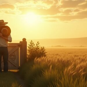
This is the story of a farmer—not just a tiller of soil, but a cultivator of ideas, dreams, and identity. A farmer who once stood at the edge of his barren field, full of hope and uncertainty, and decided to build something meaningful from the ground up. He had already mapped the boundaries of his land—his vision clear, his values rooted deep, and his purpose sprouting with conviction. But now, the time had come for something more. The time had come to give that vision a face, a feeling—a brand identity.
It was early morning. The mist still clung to the earth like a memory not yet ready to fade, and the sun peeked gently over the hills. The farmer stood in the center of his land, heart full and hands ready. He had traveled a long way in spirit, learning not only about his craft but about the people he wished to serve. He had discovered what made his brand different, what set it apart from the rest. But now came the task of turning that difference into something people could see, feel, and recognize—instantly and instinctively. It was no longer about just growing produce or offering services. It was about cultivating an experience, something unforgettable.
As he walked between the rows of freshly turned soil, the farmer began to recall all the marketplaces and stores he had visited during his many years. He remembered certain brands that had stayed with him—ones whose colors and logos still danced in his memory. Others, however, had long faded away, blending into a dull blur. He asked himself what separated the memorable from the forgettable. The answer came like a whisper riding on the breeze: identity.
A brand’s identity, the farmer now understood, wasn’t just about a clever name or a stylish design. It was about creating a bond—visual, emotional, even spiritual—with the people it wished to serve. It was about resonance. About familiarity. About the kind of presence that made someone say, “This feels like it was made for me.” It was in the colors, the language, the shape of a logo. But it was also in something deeper—the personality, the heartbeat, the soul.
The farmer returned to his barn, which had slowly transformed over time into a workspace filled with scraps of inspiration. There were magazines with striking designs, swatches of color-stained paper, and sketches pinned to wooden beams. This barn, once home to hay and tools, now cradled the future of his brand. He sat at his worktable, notebook open, and began to think—not of what he sold, but of who his brand would be if it were a person.
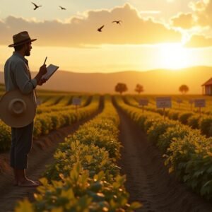
He imagined the character of his brand, the spirit it would embody. Was it quiet and grounded like the soil, or daring and untamed like the wildflowers that grew along the fences? Was it youthful or wise? Serious or warm? He envisioned a brand that was rooted in trust, heritage, and care. Something that didn’t shout, but invited. It would be a brand that felt like an old friend, steady and reliable, yet full of life.
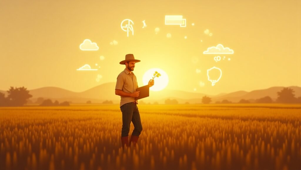
With that personality now defined, the farmer turned his thoughts to color. Just as the right nutrients influence a plant’s growth, the right colors would shape how his audience felt about his brand. He studied the world around him. The deep greens of his fields suggested harmony and nature. The golden hues of the morning sun evoked abundance and optimism. The blues of the nearby stream whispered trust and calm. He scribbled notes: earth tones, natural palettes, calming but rich, reflective of both authenticity and nourishment. Every shade would matter because every shade carried meaning.
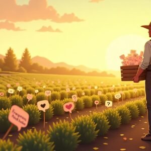
Next, he turned to symbols. What would represent his brand visually? What mark could tell his story in a blink of an eye? He filled pages with rough sketches—grain stalks, tree roots, open hands, morning suns. None were perfect yet, but each brought him closer. He wasn’t designing a logo; he was distilling a message. His mark needed to be instantly recognizable, simple but meaningful. It had to speak for him when he wasn’t in the room, on every bottle, every sign, every digital window through which the world would peek into his brand.
But symbols were not enough. The way his brand spoke mattered too. Typography, he realized, was like the tone of a conversation. Some fonts felt stiff and distant, while others were welcoming and warm. He tested serif and sans-serif, cursive and bold, rustic and minimal. He imagined a passerby reading a label on one of his products—would the letters make them feel comforted or confused? Would they lean in with curiosity or walk away indifferent? He chose fonts that mirrored the feeling of sitting on a porch after a long day—relaxed, human, familiar.
Voice was the next harvest to gather. He practiced writing his brand’s story, imagining he was speaking to someone who had never heard of his work before. The words came gently, naturally. “We grow and craft with care,” he wrote, “because you deserve to know where your food comes from.” The voice was humble, calm, clear—not boastful, but confident. It was honest and kind, never loud or slick. He tried other sentences, imagining how he’d speak on his website, on a product label, or in a conversation with a customer at the market. The tone had to be consistent, no matter the platform. It had to be unmistakably him.
Weeks passed. The farmer rose with the sun and worked late into the night. He fine-tuned his colors, redrew logos, tested layouts. He built a brand guide—not just for himself, but for anyone who might join his mission in the future. He wrote down the rules: which colors to use where, how the logo should be treated, which fonts belonged to headings, which to body text, what tone to use in different contexts. It was a map, a framework to protect the integrity of the identity he had worked so hard to build.
He didn’t rush. He knew this identity would be the coat his brand would wear every day. It had to feel right, inside and out. And slowly, piece by piece, it began to take form. Not just a brand—but a presence. A feeling. A relationship with his future customers.
One evening, standing beneath a sky painted in the colors of his brand, the farmer took a long breath. In his hands, he held something powerful. His brand now had a face, a voice, and a heart. It felt whole. It felt real. It wasn’t perfect—and it didn’t need to be. It was alive, honest, and ready to be shared.
He knew the work wasn’t over. Like any crop, a brand identity needed nurturing. It would evolve. It would adapt to new seasons, respond to new markets, grow new branches. But the roots—the values, the vision, the purpose—would remain. That foundation would hold strong through drought or storm.
As the stars emerged above his fields, the farmer smiled. His land was no longer just soil and seed. It was now a living brand, with its own essence. A brand that could connect, communicate, and endure.
And so, with a brand identity now in bloom, the farmer stepped forward—ready to share his creation with the world.
Thank you for joining us on this journey. If this story on designing a brand identity inspired you, don’t forget to like, share, comment, and subscribe. Stay tuned to Direct Moi, where purpose-driven stories come to life, one brand at a time.